A great part of all our communication is done online – yet, if we put our computers, tablets and phones away for a moment and focus on our old-fashioned, real world communication then studies show the following: 5% of what’s being said is communicated by body language and 7% by words. The remaining 38% is communicated by tone of voice.
Effectively we ‘read’ people more than we simply take in facts when we communicate. We are trying to connect with others on an emotional level and the impact of any encounter is greatly determined by rapport and emotional connection, and whether these were successfully established or not.
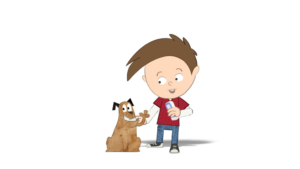
When we watch an explainer video, use a training tool or play a game, we are asked to engage, and we are more likely to do that if we feel connected in some way. Using characters is a great way through which this connection can be formed. The boy below is Ollie, a character we created for Ollie and Dog. Ollie and Dog is a series of animations explaining growth hormone deficiency to children. An illness such as growth hormone deficiency can seem scary and upsetting to a child, but when presented by an appealing aniamted character the information is a lot less daunting.
Characters are the vehicle through which a story or idea unfolds. Things happen to them or ‘through’ them and as we empathise with them we experience their emotions as if they were our own. A good character portrays the human condition in a way that deeply connects us with the idea or event that is being communicated. If the cared for character is open to a message, we, the viewer, are open to that message too.
And here it is: If your brand connects personally with its target audience in that way, your brand retention goes up too! Good character animation creates an emotional impact that stays with the audience till later – and so does your message!
Can any character achieve the same effect? We would be lying if we answered ‘yes’. However, you are definitely on the right track if your character design can be instantly read, is clear and recognisable, and in some way charming – maybe add a little quirk or flaw! Characters are often more interesting if they are not too perfect. Even a simple character design can go a long way when attributed with a few characteristics.
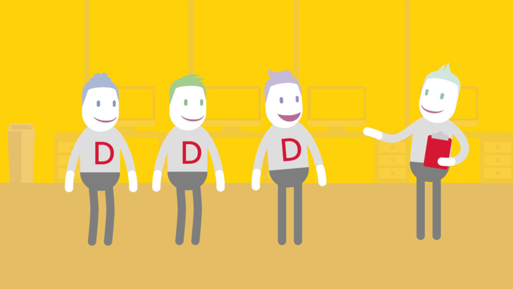
But as much as the right design is important, it’s the animation that can make or break a character. Personality really shines through when it is animated well – the character must convey thoughts and feelings really well in order to draw the audience in. If a character ‘just moves around’, if the poses and emotional states can’t be read clearly and the timing is off then you are not getting the best results. Good animation however can bring life into the most minimal designs and really make us laugh, chuckle or blush… Whatever the desired reaction. Below is an one of the animations from an ongoing series Sliced Bread created for the Austrian insurance company, UNIQA. The same character is used throughout the animations, providing easy brand recognition, while aiding communication of each message.
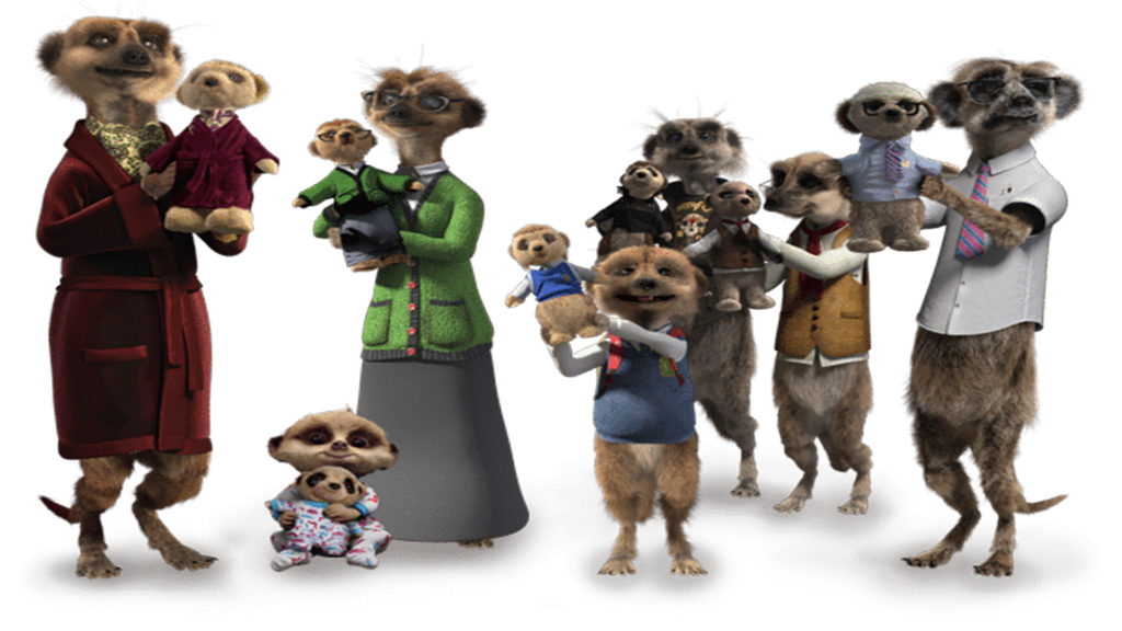
There are many great examples of well-loved characters that aid communication and connect with their business’ audience, such as Aleksandr and Sergei – the meerkats from Compare the Market advertising. Insurance is not exactly an exciting topic for most people, yet when paired with two lifelike animated meerkats, viewers pay attention. Using these animated characters allow Compare the Market to communicate each message or offer with a level of comedy that appeal to the viewers. In 2009, meerkats became Britain’s favourite animal, 12 months after the ‘Compare the Meerkat’ campaign went live. Since then Compare the Market’s ads have evolved to incorporate celebrity cameos, and loyal fans can even buy merchandise of their favourite character.
This isn’t a recent trend, over 50 years ago Kellogg’s debuted their adverts containing animated characters. Prior to this, the advertising for the brand failed to catch people’s attention, and despite good sales, W.K. Kellogg wanted to stand out from the bland campaigns of his competitors. Ad agency Leo Burnett started creating characters for Kellogg’s in 1950, starting with Tony the Tiger, and throughout the years following adding characters for each of their cereal brands. By 1970 their market share had rocketed to 45 percent.
Communication is crucial, regardless of whether your audience is your workforce, or your customers. Why not add an animated character or mascot to your advertising, or e-learning programme? If we have got you thinking about how you can connect with your audience more meaningfully, get in touch with us by emailing info@sbanimation.com, or call us on +44 (0)207 148 0526.


