“Focus on the user and all else will follow.” ~ Google
How many times have you been left frustrated trying to find a product you want on a website, or even more commonly, trying to purchase something online?
Every interaction a brand has with a consumer has to be meaningful and offer value. To engage consumers and persuade them to buy products through your website portal, providing customers with excellent user experience (UX) on desktop computers and mobile devices is essential.
Today’s web builds have to be human-centred. The primary focus is for the user-interface (UI) to be intuitive, responsive and communicative so the user knows exactly what is happening at all times. Animation brings the user-interface to life and can also be used to help guide customers where you want them to go next. Visual cues can direct eyes, excite users and keep them informed every step of the way to the checkout.
Far too many websites present barriers. According to Shopify, two of the most common reasons people abandon shopping carts is because they are asked to create an account or the checkout procedure is too complicated. Often, when users don’t complete forms correctly, it is not always obvious what they did wrong. Likewise, when they are successful, the congratulations are so understated, customers are left in confusion.
Users want to know their status within a system in a reasonable time. Google says, “The goal of good UX is to help users do what they want to do when interacting with your business.” A website should always keep users informed about what is happening. Animation provides appropriate feedback at the right moments within a reasonable time.
Functional Animation on Websites
Functional animation can be used to fulfil multiple potentials on a website. The key objective is to provide visual feedback or encourage users to take action. Visitors to a website don’t only want to see attractive aesthetics, they want to be able to navigate the site and get to where they want to be quickly.
Elements within a UI such as buttons, bars and controls enable users to intuitively understand what is happening. UX is enhanced by using visual cues that support the expectation of users and motion cues that invite users to participate in the interaction. Animation grabs the user’s attention. It is a powerful feature that guides users to the desired outcome and can be used to provide feedback at critical points. For example, use animation to acknowledge whether the action was successful or not, and what the user should do next.
“The reason why animations are so great is that you can use them to communicate all sorts of statuses, to instruct behavior, to draw attention and to add affordance, or simply to let users see what the consequences of their actions would be.” Reference link
Examples of UI Animation
With the advancements of digital technologies, consumers demand a superior UX when visiting a website. Static pages are a thing of the past. Animated features on a website are critical. Here are a few examples of how animation enhances user-experience.
Value Displays
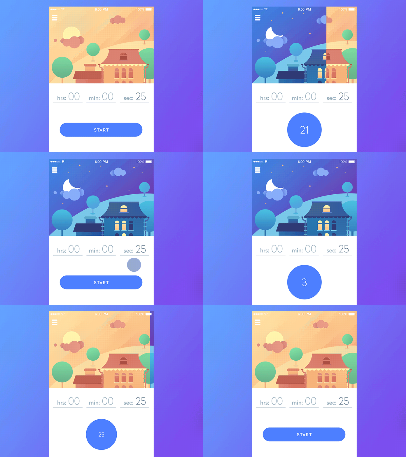
Value displays provide relevant information such as time, amounts and metrics. Rather than flashing a static number on the screen, animation allows numbers to tick over. This evokes expectation in users and releases dopamine in the brain – a neurotransmitter that gives us the ‘feel-good factor.’
Prompts
When you want to draw attention to particular elements, motion animation can be used to prompt some sort of interaction – especially in cases when the next move is not obvious. Small unobtrusive animation helps to provide effective communication and aid navigation.
Error shakes
When users do not complete a field correctly, it’s not always easy for them to know when there is an error. Animated shakes are a universal tool for ‘no’ – like someone shaking their head. It helps to inform users that an error needs addressing.
Narrative
Visual storytelling is an effective communication tool. Animated features that explain what is happening in periods where a wait is required, satisfy communication requirements and maintain user engagement.
For example, when you are verifying the bank details are correct at checkout, why not use an animated feature of a bank teller examining bank ID.
Demonstrate operability
Brands that sell software or technologies that require a user manual can use animation to demonstrate usability. Animation makes explanations far easier to grasp, reduces the learning time and keeps customers engaged.
Delight customers
Providing good UX empowers customers. When they can confidently use a website, they feel more satisfied – which ultimately translates into higher conversion rates.
Animation is a powerful strategy to delight users and enhance their experience when they visit your website. With more businesses upgrading their websites with a focus on UX, brands that fail to excite users risk missing out on sales and repeat customers.
Are you are thinking of incorporating an animated user experience into your customer retention and acquisition? Drop us an email at info@sbanimation.com, or give us a call on +44 (0)207 148 0526


