We have produced a number 2D animation explainers for the healthcare and medical sector which helps explain complicated treatment processes within the body.
Whilst 3D animation is still the ‘star of the game’ in delivering beautiful and captivating imagery that is highly explanatory and helpful in gaining understanding about the inner workings of healthcare treatment, we would like to demonstrate how 2D animation can make a similar difference to your communication, but in a time and cost effective way.
Generally due to ‘next-to-nothing-render-times’ (compared to 3D animation), a 2D medical animation can often be produced in a lot quicker time. Less turnaround time, also means more flexibility in working with smaller budgets.
Case Study 1:
An ear, nose and throat surgeon approached us with the need to explain the process of several salivary gland surgeries. He needed his patients to understand the steps but wanted to spare them the sight of real blood and incisions into the flesh (believe me you need a strong stomach to watch this).
By drawing up the scene in 2D we could choose for the style and colour setting to be clean and warm and just simplify the relevant elements, like the incision, gland, tumour and operative instruments to a level that is easy to watch.
We made it comprehensive, informative and clear. Then the clean style of the animation also emphasizes the simplicity of the procedure, reducing the fear when facing the possibility for this treatment. In this instance animation helps to simplify real settings that would simply be too upsetting if shown in its real environment.
Case study 2:
Our BCUK case study also offers a brilliant example for adding a layer of detachment through 2D animation, where the emotional aspect would simply be too overwhelming. Colonoscopies are no easy topic and bring on not only a certain level of anxiety but for some of us also shame and other unpleasant emotions.
In order to show the simplicity of the procedure and how many lives can be saved if more people are educated about its process and value, our client went for a simple 2D approach to show what awaits the patient.
The characters are minimalist and abstracted, but still varied enough in their attributes to represent all types of people and ethnicities. This way diversity and inclusivity can be represented.
Case study 3:
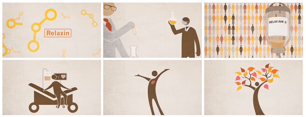
An award winning MedComms agency asked us to explain the process of a ‘post heart attack medication’ in regards to the death and recovery rate of heart attack patients. We explained the workings in our usual clear way but tried to add a human touch, considering that this was relating to the topic of death explicitly.
Rather than just showing the patient alive in his hospital bed we decided to let him bloom and blossom to show life in contrast to death. Emphasising success and good health, and then returning to full strength – we animated the patient into a tree, representing strength and recovery. Animating metaphors to represent abstract ideas, can bring feeling and emotion back into your communication.
Case study 4:
We illustrated, and then animated the benefits of the medication for another leading healthcare agency. Initially the end-client wanted all benefits and USPs written out on slides so that they could also be used in a PowerPoint presentation. If the thought of this has already sent you to sleep, consider this…
We managed to convince the client to go with big musical number! So we built an all-singing and dancing animation starting with the fully recovered patient singing the praises of the medication in the doctor’s office, remembering his admission to hospital, surgery and recovery.
As scene transitions, doctors and nurses pull down informative slides (the PowerPoint bit!) about the medication that has led to such a happy outcome. Still slides or other assets feature in a variety of marketing materials can be built into the animation creatively and interestingly.
The singing doctor really lifts the mood. Using humour is a great way to lighten up heavy topics. So much so that this piece was a PM Society Award winner.
Case study 5:
When it comes to explaining medication and bodily processes to children and young adults, animation really is the best tool. Especially if they are told through stories that happen to their favourite characters.
The agency approached us to animate an anime like style character that the young viewers could affiliate with. His fall and subsequent bleeding leads the viewer to the inner workings of factors in their blood – also represented as characters – explaining how a normal healing process would work compared to that of a bleeder.
The scene is narrated by Dr Phillpa who is always at hand to explain the process while the animation plays. Giving the blood clotting factors character features makes it easier for children to engage and remember what is happening.


